


Best Roller Coaster: Wood vs. Steel

Standards
CCSS.MATH.CONTENT.6.SP.B.4 Display numerical data in plots on a number line, including dot plots, histograms, and box plots.
CCSS.MATH.CONTENT.6.SP.B.5.C Giving quantitative measures of center (median and/or mean) and variability (interquartile range and/or mean absolute deviation), as well as describing any overall pattern and any striking deviations from the overall pattern with reference to the context in which the data were gathered.
CCSS.MATH.CONTENT.7.SP.B.4 Use measures of center and measures of variability for numerical data from random samples to draw informal comparative inferences about two populations.
CCSS.MATH.CONTENT.7.SP.B.3
Informally assess the degree of visual overlap of two numerical data distributions with similar variabilities, measuring the difference between the centers by expressing it as a multiple of a measure of variability.
CCSS.MATH.PRACTICE.MP3 Construct viable arguments and critique the reasoning of others.
CCSS.MATH.PRACTICE.MP5 Use appropriate tools strategically.
Introduction:
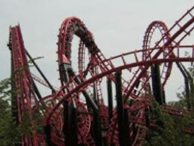
Introduce students to the overall debate: wood vs. steel roller coasters…which one is better? To motivate the discussion, show students pictures or video (for example: https://www.youtube.com/watch?v=36XbsxVT1tw) of the two types of roller coasters.
Establish the parameters of the task: that students must make a case for either the wood or steel roller coaster, and they must back up their opinion with data.
Have an introductory discussion about possible data they could use to prove their case. Here are some ideas for discussion questions:
- )What types of variables (height, speed, length, number of twists, number of inversions, etc.) describing rollercoasters can be measured?
- )What type of data (qualitative/quantitative) would each of these variables produce?
- )What types of analysis tools (scatterplots, circle graphs, bar charts, box-and-whisker, dotplots) might be useful to prove your case?
Show them the categories of the data on different roller coasters that is available at the following website: https://www.statcrunch.com/app/index.php?dataid=1137903
Activity:
Depending on time, the teacher can alter this section as necessary.
Option 1: To allow students the most amount of autonomy, have students use the raw data to create their own graphs using online tools such as https://plot.ly/create/box-plot/.
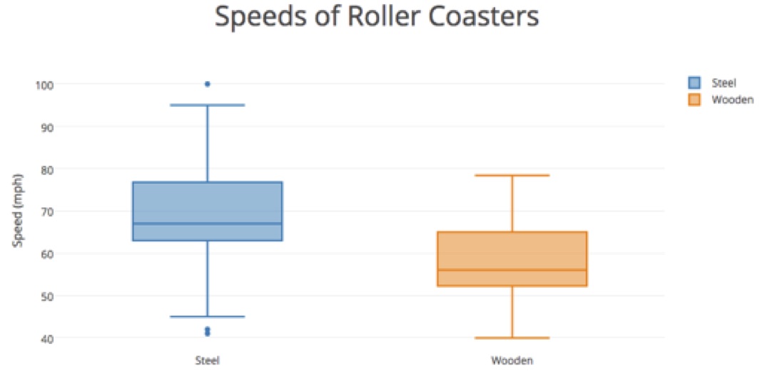
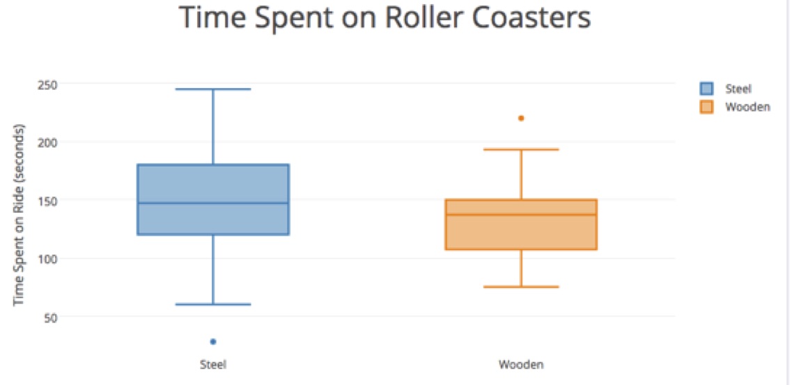
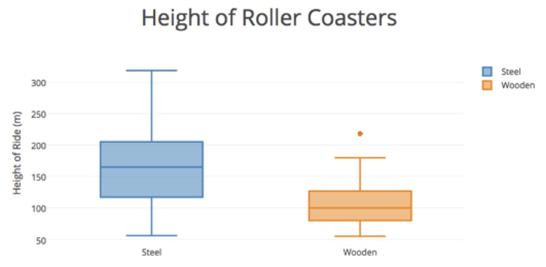
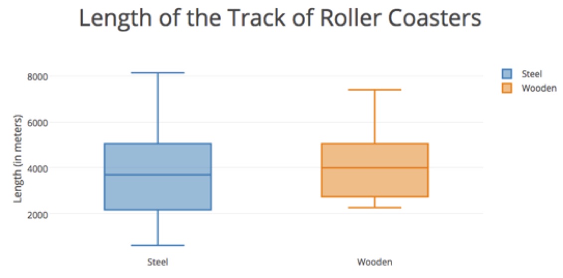
Option 2: If time doesn’t permit, then offer students the following graphs featuring four of the variables. Have students analyze the graphs and write explanations to argue their choice of the better type of rollercoaster. Remind students to be specific about the percentages of each type of roller coaster that fit a certain criteria.
After:
Discuss the analysis that students have produced as a class. Have students offer their arguments and try to convince their classmates. Consider some of the following questions to include in the discussion:
- What information does the data offer/not offer?
- How did the measures of center (median) affect your argument?
- How did the amount of variability (IQR) in the graphs affect your argument?
- How did you incorporate the outliers in your analysis?
Download this month's rich math task as a Word Document here.